Clearer indication of 'View' and 'Comment' access in Google Docs editors
In an effort to make it more clear when people using the Google Docs editors have only ‘View’ or ‘Comment’ access to a file―and to simplify the process of requesting edit access―we’re making some minor UI tweaks.
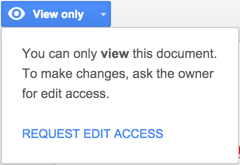
Starting today, those with ‘View only’ access to a document, spreadsheet, slide, or drawing will see a new blue button in the toolbar:

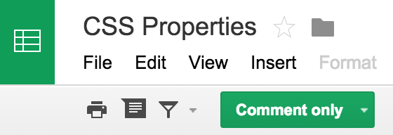
Those with ‘Comment only’ access to a spreadsheet, slide, or drawing will see a similar green button (in documents, the ‘Suggesting’ mode indication will remain in the right side of the toolbar):

Clicking on the button allows one to easily request edit access from the file owner:

Check out the Help Center for more information on file sharing.
Launch Details
Release track:
Launching to Rapid release, with Scheduled release coming in two weeks
Rollout pace:
Full rollout (1-3 days for feature visibility)
Impact:
All end users
Action:
Change management suggested/FYI
More Information
Help Center
Note: all launches are applicable to all Google Apps editions unless otherwise noted
Launch release calendar
Launch detail categories
Get these product update alerts by email
Subscribe to the RSS feed of these updates
Starting today, those with ‘View only’ access to a document, spreadsheet, slide, or drawing will see a new blue button in the toolbar:
Those with ‘Comment only’ access to a spreadsheet, slide, or drawing will see a similar green button (in documents, the ‘Suggesting’ mode indication will remain in the right side of the toolbar):
Clicking on the button allows one to easily request edit access from the file owner:
Check out the Help Center for more information on file sharing.
Launch Details
Release track:
Launching to Rapid release, with Scheduled release coming in two weeks
Rollout pace:
Full rollout (1-3 days for feature visibility)
Impact:
All end users
Action:
Change management suggested/FYI
More Information
Help Center
Note: all launches are applicable to all Google Apps editions unless otherwise noted
Launch release calendar
Launch detail categories
Get these product update alerts by email
Subscribe to the RSS feed of these updates
Clearer indication of 'View' and 'Comment' access in Google Docs editors
 Reviewed by Jay
on
10.04
Rating:


Tidak ada komentar: